Based on the heuristic audit, content analysis, and a review of competing solutions, I identified the key barriers affecting the user experience:
• no clear information about the process structure or the current step,
• increased risk of errors due to a lack of validation and in-form guidance,
• unscannable content that requires reading large blocks of text,
• a page structure that forces users to remember information rather than recognise it,
• no clear elements guiding users step by step.
BRIEF ANALYSIS focusing on the client’s objectives
The client’s goal was to improve the platform’s functionality and refresh its visual layer, with a particular focus on the form. From the user’s perspective, the issues were a long and unclear application process, uncertainty about whether the entered data was correct, and language and content that made it difficult to understand requirements quickly. From a business perspective, the key priorities were increasing conversion and reducing the support team’s workload through a clearer structure and better guidance throughout the process.
— Objective and scope: The client expects increased website functionality and a visual refresh.
— Key issues reported by users:
• An unattractive look and layout of the website, which may discourage users and reduce conversion.
• The form is too long and requires significant cognitive effort to complete.
• The form structure is not intuitive, which creates uncertainty about whether the entered data is correct – this often results in contacting the support team (generating additional costs for the business).
• The website’s copy and language are difficult to understand, making it harder to find the necessary information quickly.
— Key client needs:
• Improve usability and comfort when using the form and the website overall.
• Increase conversion and sales.
• Introduce a modern “business-casual” style that will not be associated with either a typical commercial website or a government service – finding the right balance in visual communication.
• Create a friendly, intuitive, and accessible website for a wide range of users.
• Implement solutions that genuinely simplify the form or make completing it feel less demanding.
— What needs to be delivered?
• A refreshed concept / high-quality visual design for the homepage.
• A refreshed concept / high-quality visual design for the visa application form.
— Timeframe: 17.10.2025 - 23.10.2025
— About the client:
• eVisa Express is an independent company offering efficient and professional support in obtaining visas online. It is not affiliated with any government agency.
• An e-Visa entitles the holder to enter the selected country. The application process can be completed in under 15 minutes using any device with internet access.
• With a team of specialists supporting applicants at every stage, customers can be confident the process will run smoothly and without issues.
• Users can contact the support team by phone or email. Support is available in English, German, Spanish, and Chinese.
• The redesign concerns the page dedicated to visas for India. The platform’s main benefits include: fast application processing, 24/7 customer support, a variety of payment methods, multilingual support, and expert knowledge that increases the success rate of submitted applications.
— About the target audience:
• The target audience consists of people applying for a visa to India – for themselves, family, or friends. They most often land on the website after searching phrases such as “how to get a visa to India” or “a company that helps you get a visa to India”.
• Some users look for information about the self-service application process and only later decide to use the company’s support. Others know from the outset that they want to entrust the formalities to specialists.
• The platform’s key values for this group are: fast application processing, efficient 24/7 customer support, a variety of payment methods, multilingual support, and expert assistance that increases the chances of a successful outcome.
Competitor analysis
In this analysis, I compared the client’s solution with the government portal and a commercial platform with a similar service model to identify best practices in user guidance, content structure and form design. The biggest differences related to how process stages were presented, the quality of navigation and the level of support when completing fields – including validation, hints and error messaging.
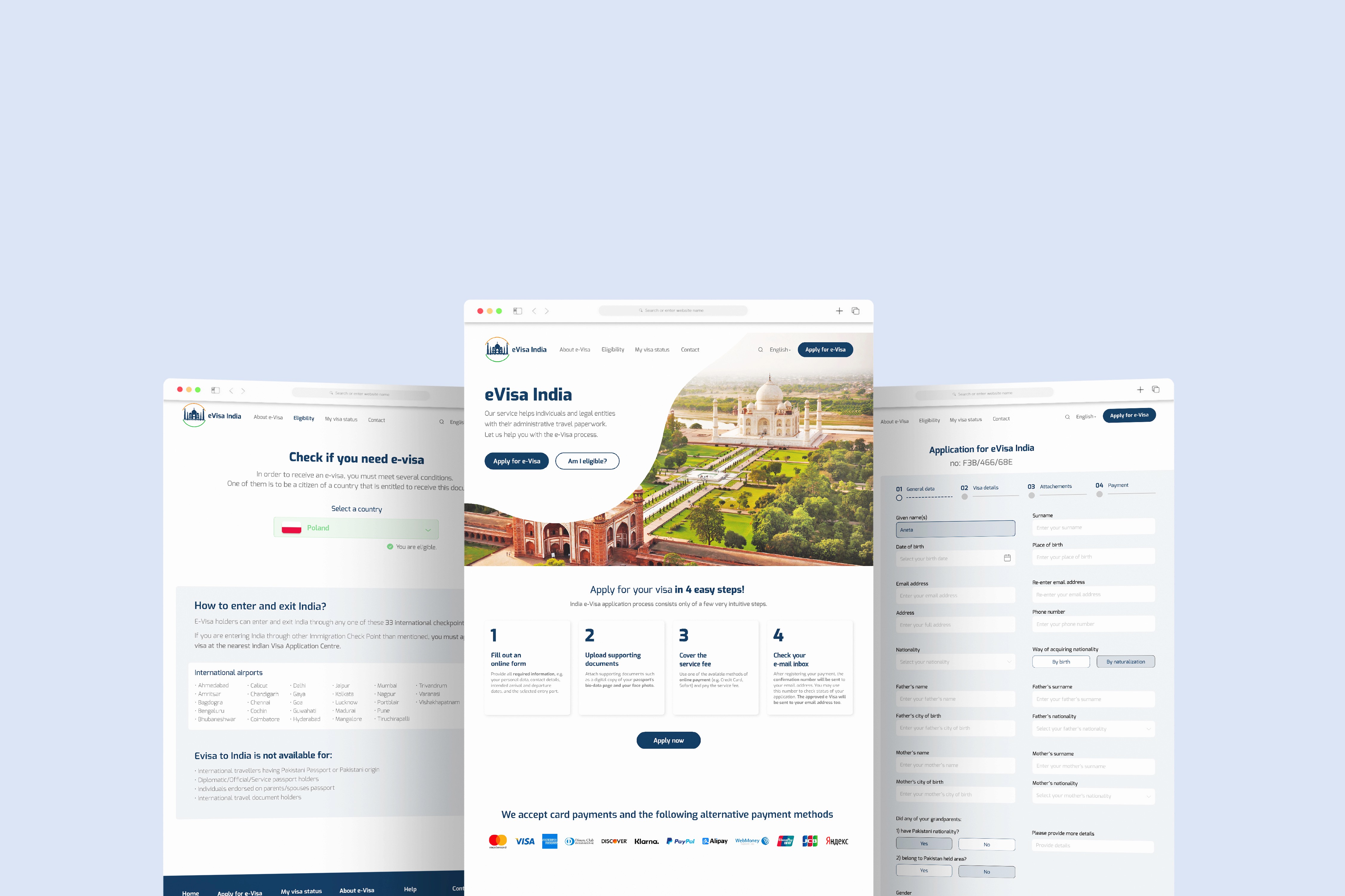
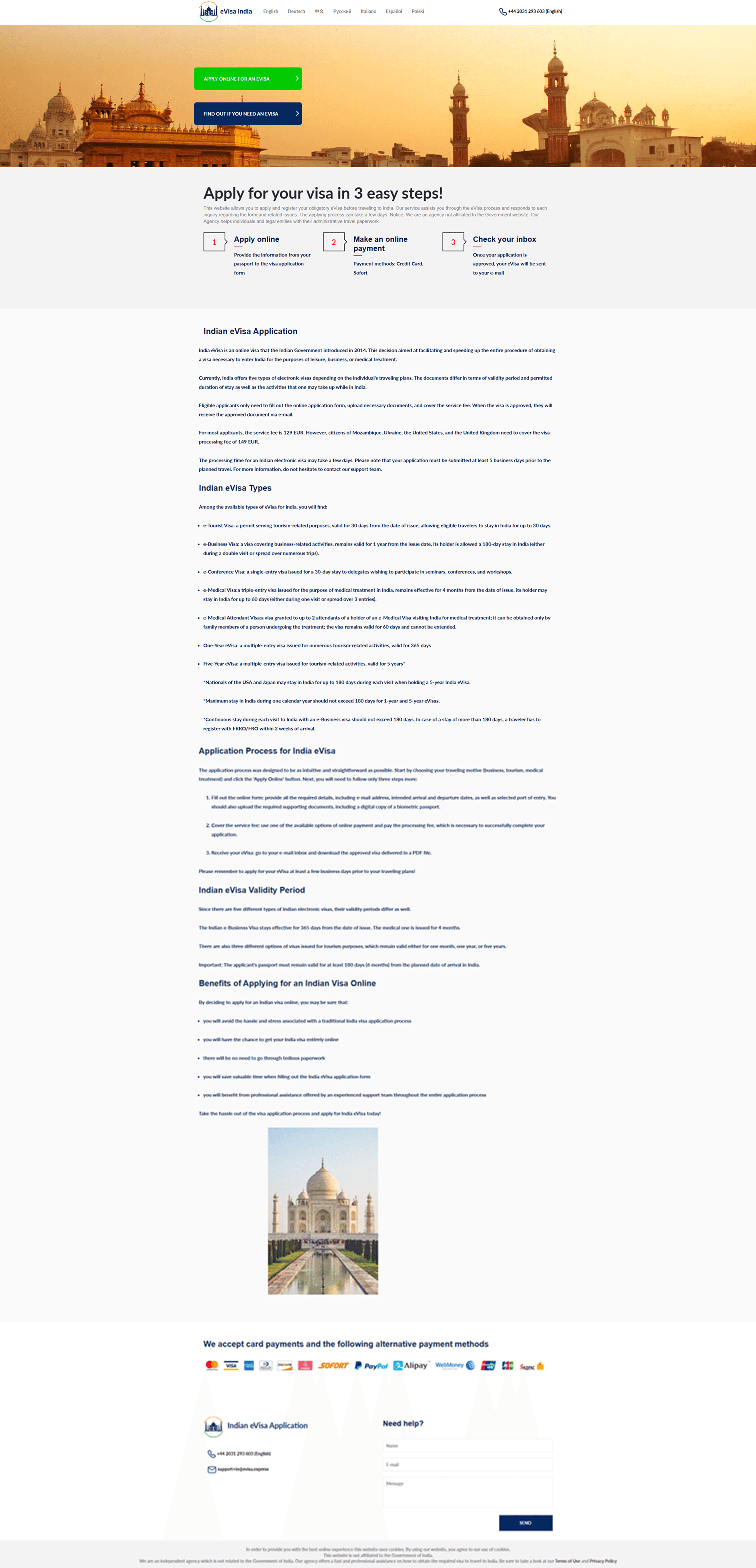
1) Client website: visa-to-india.com
About the website: An independent company offering efficient and professional assistance with obtaining an Indian visa online. It is not affiliated with any government agency. The application process can be completed in under 15 minutes using any device with Internet access.
Website content
Homepage:
• Language selection
• Telephone support
• Two CTA buttons: “Apply online for an e-visa” and “Check if you need an e-visa”
• 3-step process explanation
• Information about e-Visa India
• List of available payment methods
• Contact details
• Contact form (“Need help?”)
• Cookie information and privacy policy
Additional pages:
• “Apply for an e-visa” – visa application form
• “e-visa requirements” – general information, requirements, eligibility and a list of 33 international border control points
Number of form stages:
• Step 1
• Step 2
• Step 3
• Payment
• Visa delivered by email
Support and assistance:
• Telephone and email contact
• Contact form
• Support languages available: English, German, Spanish, Chinese
Language versions:
• English
• German
• Chinese
• Russian
• Italian
• Spanish
• Polish
Design: Compared with competitors, the website looks tidy, clear and relatively modern.
Credibility and clarity of content
The content is credible and presented in an accessible way. The main areas for improvement are:
• organising the information structure,
• standardising terminology,
• shortening and simplifying the visa application form.
Other than that, the messaging is clear and easy to understand.
Ease of use: Language selection and the main actions (CTAs) are clear. Some confusion may be caused by the lack of a conventional header with a menu and a standard footer. The contact form placed at the very bottom of the page may come as a surprise to users.

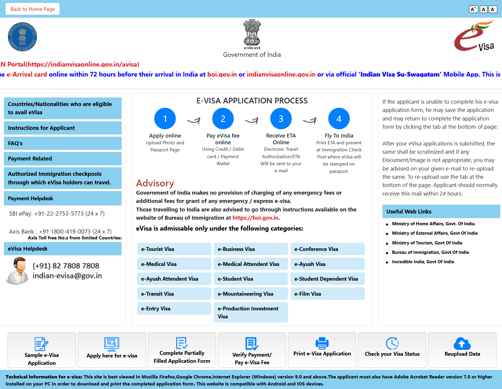
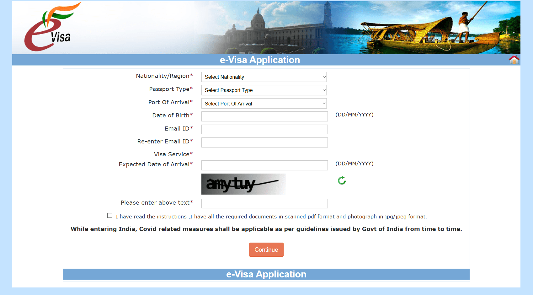
2) Government of India: indianvisaonline.gov.in/evisa/tvoa.html
About the website: The official, authorised portal for submitting visa applications for India. Content managed by the Immigration Bureau of the Ministry of Home Affairs.
Website content
The homepage includes:
• List of countries/nationalities eligible for e-Visa
• Instructions for applicants
• FAQ
• Payment information (Q&A)
• List of authorised immigration checkpoints
• Contact details (technical support for payments and e-Visa)
• Description of the application process stages
• Information and guidance (visa categories)
• Useful links
• Technical information
Additional features:
• Sample e-Visa application (PDF)
• Apply for e-Visa – form
• Complete a partially filled application → log in → edit
• Check / pay for e-Visa → log in
• Print the application → log in
• Check visa status → log in
• Re-upload details → log in
Number of form stages: approximately 7–8 steps
Support and assistance:
• Telephone and email contact
• Language available: English
Language versions:
• English
Design: The website looks outdated and needs modernisation in terms of visuals and UX.
Credibility and clarity of content: It contains a large amount of unstructured text. Field descriptions and labels are unclear in places. Some information is duplicated or phrased imprecisely.
Ease of use: The website is not user-friendly. The volume of content and the lack of a clear information hierarchy make it difficult to quickly find the necessary details.
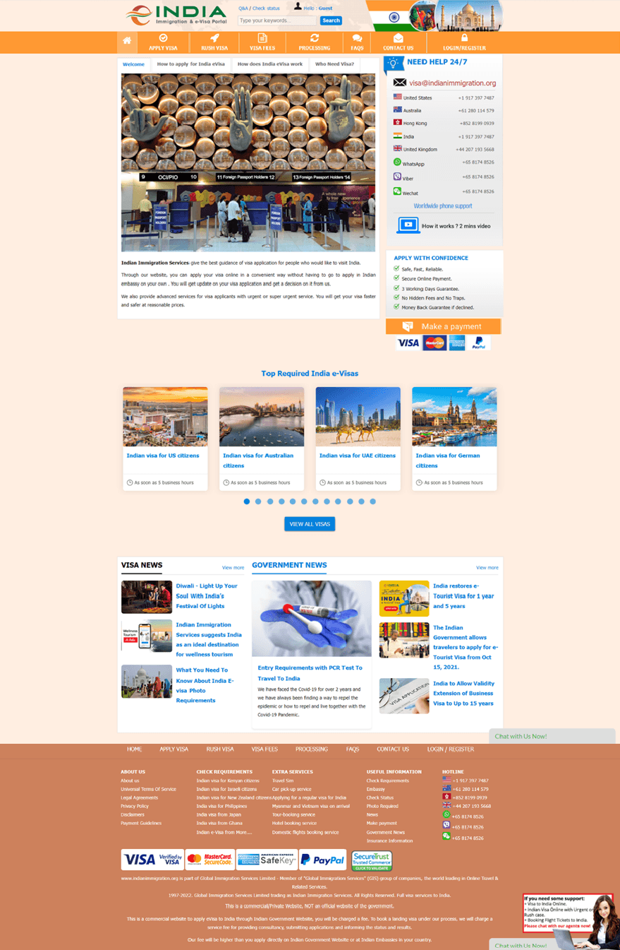
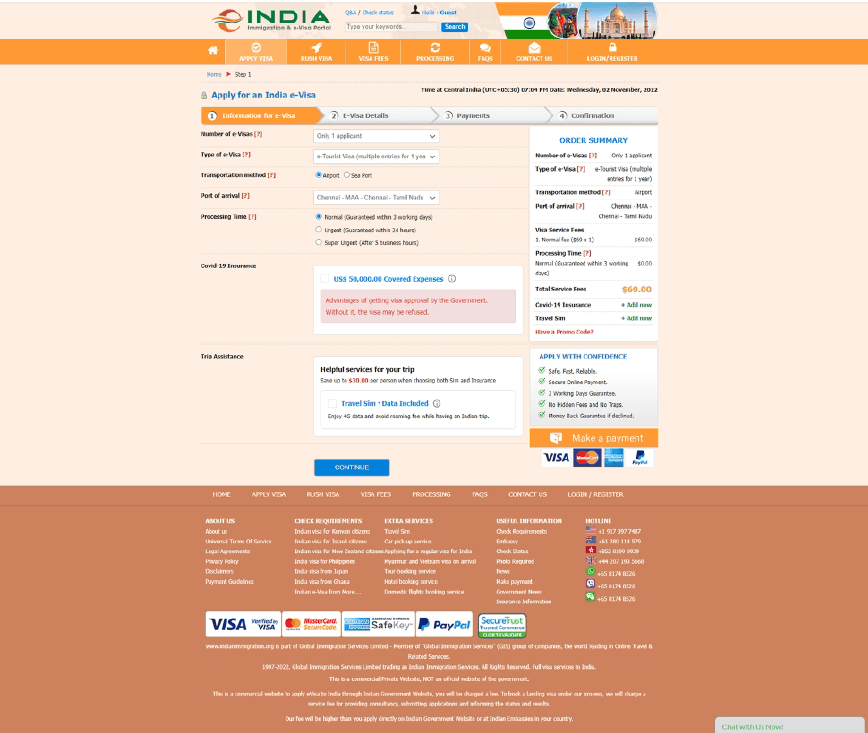
3) India Immigration & e-Visa portal: indianimmigration.org
About the website: Global Immigration Services Limited provides support throughout the process of applying for an Indian visa. The website allows users to apply online without visiting an embassy in person. Users receive information about their application status and the decision. The company also offers expedited services.
Website content
Homepage:
• Header: FAQ, Check status, user account (“Hello: Guest”), search bar, menu
• Informational sections: how to apply, how the e-visa works, who needs a visa
• Contact details
• Information about service quality and payment methods
• Most popular e-visas → see all
• Visa and government news → see more
• Chat
• Footer with additional links and terms/regulations
Pages:
• FAQ (search, list of questions, contact form)
• Check status → enter details
• User account
• Search
• Apply for a visa – form
• Express visa – form
• Visa fees – breakdown into government fee and administrative fee
• Processing – 4-step description
• Contact – extended form
• Log in / register
Number of form stages:
• Step 1: e-visa information
• Step 2: application details
• Step 3: payment
• Step 4: confirmation
• The form contains fewer questions than the client’s form
Support and assistance:
• Telephone and email contact
• Contact form
• Support languages available: English, Chinese
Language versions:
• English
Design: The website feels outdated and requires visual modernisation as well as a simplified structure.
Credibility and clarity of content: The content is presented in a loosely organised way. There is a sense of text overload. Some information is repeated or phrased imprecisely.
Ease of use: The service offers many functions; however, the volume of features and the lack of a clear hierarchy may cause confusion. Finding key information is not intuitive.
CONTENT AUDIT
In the audit, I identified violations of key usability heuristics – primarily in the areas of system status visibility, error prevention, and recognition rather than recall. In addition, the content audit confirmed issues with information prioritisation, inconsistent language, and a structure that hindered scanning, which – in the context of a high-stakes task – increased user stress and the risk of abandoning the process.
1) HEURISTIC REVIEW
Website testing using Jakob Nielsen’s heuristics (general usability guidelines for websites and applications).
Scope: analysis of the client’s website visa-to-india.com – evaluation of the site’s content and functionality, and identification of elements requiring improvement.
Business objectives:
• a useful, intuitive, and accessible website for all users – improving the site’s UX
• business growth – increased conversion and sales
• increased user satisfaction
User objectives:
• planning a trip to India and submitting an e-visa application (both for users who qualify and those who do not; in the latter case, users should receive clear information via on-site content or consultant support)
• obtaining an e-visa with minimal formalities by using an intermediary service
• a friendly, intuitive website that enables quick access to information and smooth completion of formalities with minimal cognitive effort
• satisfaction with the company’s services, reliable support, and clear information
— Heuristic Evaluation
Evaluator’s name: Aneta Bołoz
Device / browser / operating system: Lenovo IdeaPad / Chrome / Windows 10 and iPhone 11 / Safari / iOS
Severity rating scale:
0 = I do not agree that this is a usability problem
1 = Cosmetic issue: fix if time allows
2 = Minor usability issue: low priority to fix
3 = Major usability issue: important to fix, high priority
4 = Usability catastrophe: should be fixed as soon as possible
1. Visibility of system status - severity rating: 3
Violation:
• Both devices: After clicking the CTA buttons, the user does not know where they are in relation to the homepage.
• Web version: No menu and no clear navigation.
• Mobile version: No clear navigation; the menu only allows language selection and is misleading. Returning to the top of the page requires extensive scrolling.
• Web version: The form steps are shown, but they could be presented in a different, more engaging and clearer way.
• Mobile version: No progress indicator in the form.
• Both devices: On hover / tap, the CTA buttons are not clearly highlighted – the user is not sure whether the button has been activated.
• Both devices: The confirmation message after submitting the contact form is not sufficiently clear or visible.
• Both devices: Form hints are presented in a low-visibility, user-unfriendly way.
• Both devices: Insufficient error communication in the form.
Recommendations:
• Both devices: Add a simple menu and clear navigation in a modern, business-casual style.
• Mobile version: Improve on-page navigation – add a “back to top” button or a persistent (sticky) menu.
• Web version: Introduce a new way of presenting the progress indicator. Inform users about the time needed to complete the form.
• Mobile version: Add a progress indicator. Inform users about the time needed to complete the form.
• Both devices: Redesign the buttons so they stand out clearly on hover / tap.
• Both devices: Redesign and rewrite the contact form confirmation message so it is clearer and more visible.
• Both devices: Change how form hints are presented – keep them short and easy to read.
• Both devices: Use different wording and visual formats to communicate errors.
2. Match between system and the real world - severity rating: 1
Violation:
• Both devices: Information could appear in a more natural and logical order. It could also be presented in a different, more engaging and clearer way.
Recommendations:
• Both devices: Prioritise content and arrange it in the appropriate order.
3. User control and freedom - severity rating: 2
Violation:
• Both devices: Browser navigation arrows are available, but the site lacks a menu.
• Both devices: The form includes a Back option, but there is no Cancel application option to remove data already entered.
Recommendations:
• Both devices: Add a website menu.
• Both devices: Add a Cancel option in the form.
4. Consistency and standards - severity rating: 2
Violation:
• Both devices: Button styles are inconsistent.
• Both devices: Page content could be organised in a way that is more familiar to users.
Recommendations:
• Both devices: Use a single button style.
• Both devices: Structure content in a way that is more familiar to users.
5. Error prevention - severity rating: 4
Violation:
• Both devices: The form should be designed to be clear and error-preventive.
Recommendations:
• Both devices: Use question design and form structure to prevent errors:
- offer suggestions (e.g. geolocation),
- include helpful constraints,
- choose good defaults (e.g. useful when users perform repetitive actions),
- use forgiving formatting (e.g. for a phone number field, accept spacing such as 000 - 000 - 000),
- follow design conventions,
- communicate available options.
6. Recognition rather than recall - severity rating: 4
Violation:
• Both devices: Users should not be forced to remember information from one part of the interface to another (no menu).
• Both devices: The form is fairly long and requires significant effort.
Recommendations:
• Both devices: Minimise users’ memory load by making elements, actions, and options visible. Field labels and menu items should be visible and easily accessible when needed. Add a menu and clear navigation.
• Both devices: Design the form to be shorter – or to feel shorter. Provide help with form completion wherever possible so users do not have to search for additional information themselves.
7. Flexibility and efficiency of use - severity rating: 4
Violation:
• Both devices: There is no search tool to help users find the information they need.
• Both devices: The visa form is long and takes a lot of time to complete.
Recommendations:
• Both devices: Add a search bar.
• Both devices: Shorten the visa form.
8. Aesthetic and minimalist design - severity rating: 3
Violation:
• Both devices: Content is not well organised and could be structured more clearly.
Recommendations:
• Both devices: Organise content with the “less is more” principle in mind.
9. Help users recognise, diagnose, and recover from errors - severity rating: 3
Violation:
• Both devices: Error information should be communicated in a more accessible and visible way.
• Both devices: Guidance and questions may be unclear for users.
Recommendations:
• Both devices: Communicate errors more effectively and suggest solutions where possible (including visual cues).
• Both devices: Prevent errors wherever possible through clear guidance and suggestions.
10. Help and documentation - severity rating: 3
Violation:
• Both devices: There is no help / FAQ / guidance / walkthrough that could help users find solutions and answers.
• Both details: Contact information should be more visible.
Recommendations:
• Both devices: Add a “Help” page.
• Both devices: Make contact details clear and highly visible.
— Usability Checklist
I carried it out to complement the data and ensure that all issues were identified.
User experience:
✓ Registration provides benefits to users. Unnecessary registration is avoided.
✓ The website is trustworthy: credible testimonials, credentials, contact details, location, and photos of real people are displayed.
✓ The website is professionally designed and up to date.
X Sample content - e.g. a sample newsletter is shown next to the newsletter sign-up form.
✓ Personalised features. Currency, language, country-specific offers, taxes, or delivery options change depending on the user’s location.
✓ IP-based geolocation is not enabled without the user’s consent.
✓ Transparent pricing. Prices are clearly displayed. There are no hidden costs or surprises in the terms and conditions.
✓ Clear product and service information. Information is easy to review, and images can be enlarged or zoomed for a more detailed view.
Homepage:
✓ Clear call to action. Users know what to do next and why it benefits them. They understand the value proposition and the page’s purpose.
X First impression. The homepage creates a positive first impression and supports conversion.
✓ The company’s contact details are easy to find on the homepage.
✓ A privacy policy and terms of use are available.
✓ Images and videos are relevant and meaningful.
Navigation:
✓ Important links are not placed in moving elements such as auto-rotating carousels and accordions.
✓ Alphabetical sorting is used only when there are no better alternatives, such as grouping items into descriptive, related groups.
X Navigation is available and consistent on every page.
✓ Links are descriptive. There are no “click here” links.
✓ The browser window title includes a page description that is easy to understand as a tab label.
✓ The page URL is easy to remember.
Search:
X A search function is available for large websites.
X Search is available on every page, not only on the homepage.
X The search field is wide enough for users to see what they have typed.
Links:
✓ Important actions are displayed as buttons rather than links. For example, “Buy” or “Pay” is a button, not a link.
✓ Links are easy to recognise. They look clickable. Elements that are not links do not look clickable, e.g. underlined text is avoided.
X The colour of visited links differs from the colour of unvisited links.
✓ There are no broken links.
✓ Links, buttons, and tick boxes are easy to click.
Layout:
✓ The most important content is shown first.
✓ The site is responsive – it works across different screen sizes and browsers. It is optimised for mobile users.
✓ Related information is clearly grouped.
✓ The number of pop-ups is kept to a minimum.
✓ Pages are not overcrowded – there is enough white space, making content quick to scan.
Form:
X Simplicity.
✓ Long drop-down lists are avoided. Instead, the user can type text that is validated server-side (backend).
✓ Fields are labelled with simple, common names, e.g. First name, Address.
X Error messages are shown next to the relevant field, not only at the top of the page.
Content:
✓ Contrast - sufficient contrast between text and background.
✓ Content is easy to scan (quick reading).
✓ Content is written in simple, clear language.
✓ Contact details are clearly visible.
X Content is useful and answers users’ most frequently asked questions.
✓ Avoids using all caps in body text – it is used only for formatting purposes.
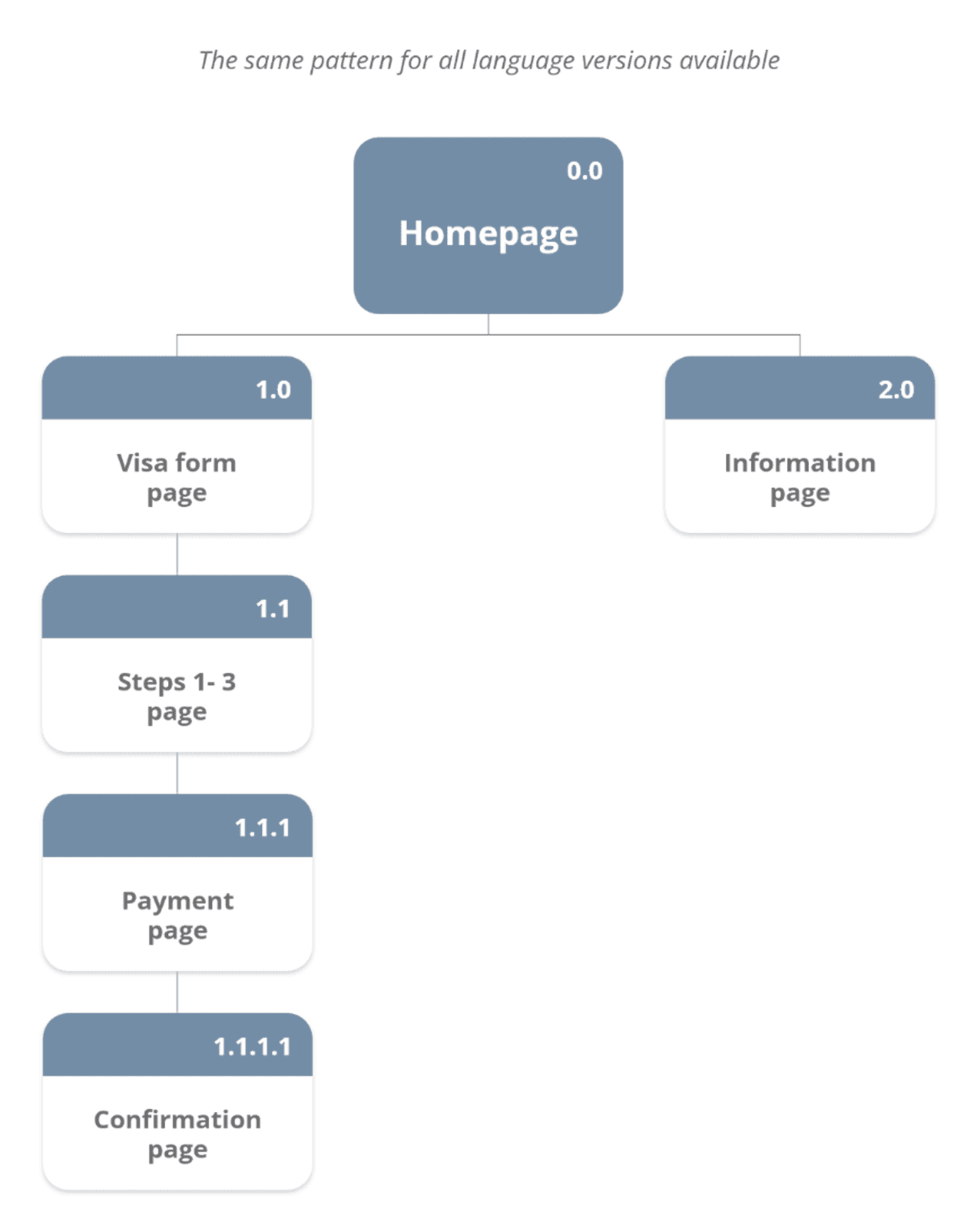
SITE MAP
To organise the platform’s structure, I created a site map, which helped identify:
• an excess of content and a lack of clear information hierarchy,
• inconsistent grouping of sections,
• a lack of logical connection between information and action.
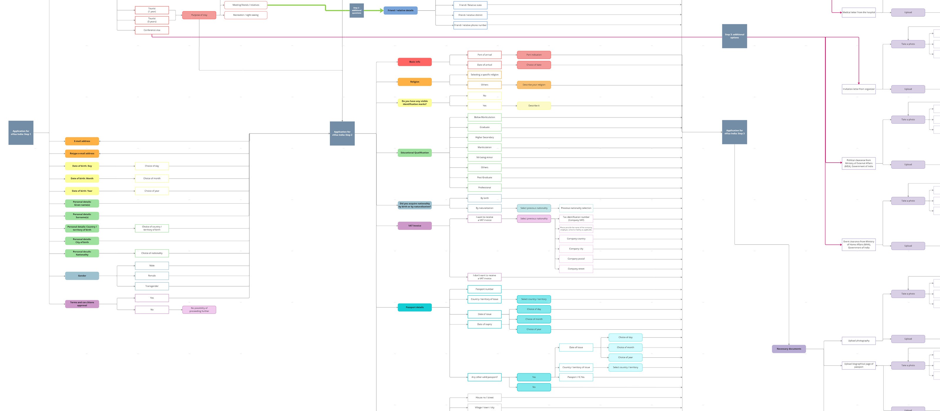
Form flow analysis
As a key element of the platform, the form was analysed in terms of:
• the number of fields and their order,
• relationships between questions,
• moments of increased cognitive load,
• potential drop-off points.
5 Whys
Problem: users dropping off during form completion.
• Why? The form feels long and time-consuming.
• Why? The user has to enter a large amount of information.
• Why? The visa procedure requires detailed information.
• Why? The data is necessary to verify identity and travel intent.
• Why? Formal requirements determine the scope of information.
— Conclusion: the number of questions cannot be significantly reduced, but the perceived burden can be lowered through a clearer structure and better user guidance.
USER EXPERIENCE MAP
I developed a user experience map covering the entire application process, focusing on emotions, moments of uncertainty, and potential drop-off points. At this stage, I analysed the process as a whole, without breaking the form down into individual questions.
PERSONA DEFINITION
I defined personas representing busy people who:
• do not have time for an in-person visit to the embassy,
• want to complete the process quickly and without mistakes,
• need clear instructions and a sense of formal reassurance.
PROBLEM STATEMENT
I am planning a trip to India. I want to apply for a visa online because I am unable to visit the embassy in person, but I keep postponing the process because the form seems too long and difficult.
Success criteria
The success criteria are:
• reducing the perceived time and effort required to complete the form,
• decreasing the number of errors through better field grouping and contextual messages,
• limiting the need to contact support thanks to a clear structure.
SITE MAP – NEW VERSION
I designed a new information architecture based on the most common user intentions:
• information,
• eligibility,
• application.
The structure was simplified and aligned with the process logic, enabling a smooth transition from learning about the service to starting the form.
Visa application form – question sorting
For the new form, I reorganised the main questions (excluding conditional questions) to better reflect their relationships. To illustrate the concept, I focused on the first two steps. I arranged the steps so users can see their progress and know what to expect.
Key design decisions
Visible structure and process status:
• persistent in-form navigation,
• a clear progress indicator,
• clear labelling of the current stage.
New form structure:
• grouping thematically related fields,
• removing the random order of questions,
• reducing contextual jumps between sections.
Preventing errors rather than fixing them:
• field formats and real-time validation,
• contextual hints,
• selection constraints where possible,
• clear error messages.
The design focuses on error prevention rather than later correction.
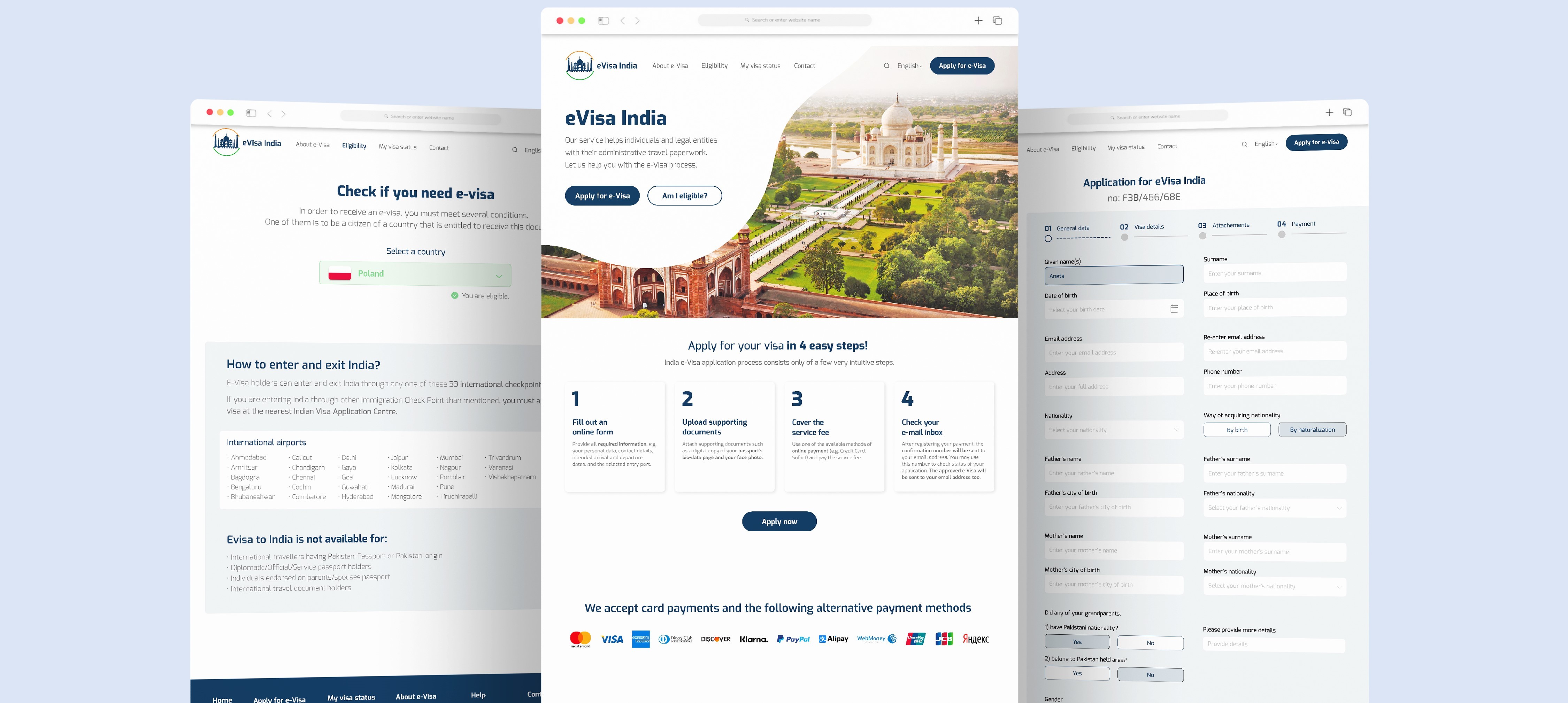
I prepared high-fidelity wireframes covering the homepage and key stages of the form. The design focuses on a clear information hierarchy, visible support elements, and consistent guidance through each step of the process.
This project was delivered as a UX/UI concept without access to implementation data and without an implementation phase. The outcome is a coherent, logical structure for the platform and form, which can serve as a foundation for further design work, usability testing, and conversion optimisation.