User needs analysis
Based on an analysis of user behaviour on inspirational and fashion platforms, I identified the key needs:
• quick access to inspiration tailored to style and context,
• the ability to share personal style without a high barrier to entry,
• a sense of community participation rather than passive content consumption.
BENCHMARK
An analysis of fashion platforms, inspiration services, and social media showed:
• an excess of content without a clear structure,
• a lack of clear mechanisms for exploring styles,
• a strong focus on sales at the expense of inspiration,
• complex or unintuitive content publishing flows.
Insights from the benchmark formed the basis for designing a simpler, more structured platform model.
Based on the research, I defined the key design directions:
• users want to browse and create, not just scroll,
• content needs to be easy to filter and organise,
• the simpler the publishing flow, the more likely users are to stay active,
• social features increase engagement and the credibility of content.
Product strategy
The product was built on three pillars:
• inspiration rather than sales,
• user-generated content as the core of the platform,
• community as the product’s main value.
Primary user intents
I identified two key user intents: creating personal outfits and exploring inspiration. These became the foundation for the information architecture and all UX decisions.
Information architecture
The platform’s structure was designed to:
• clearly separate content creation from content exploration,
• enable quick filtering by styles and tags,
• remain clear even with a high volume of posts.
User flow
I designed two primary user flows aligned with the users’ key intents. Each was optimised for the minimum number of steps and low cognitive effort.
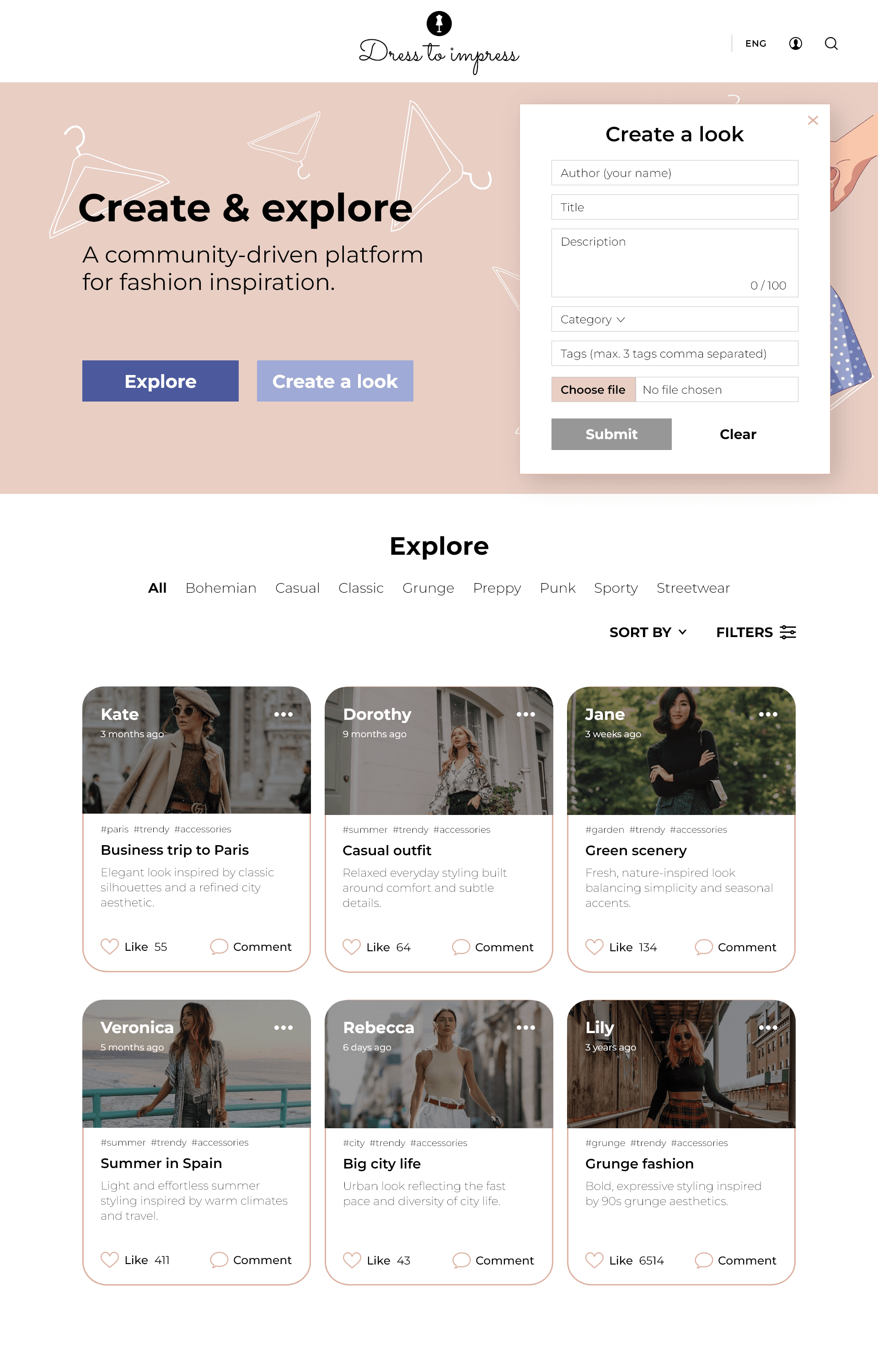
— UGC outfit creation flow
User intent: “I want to quickly add my outfit and share it with others.”
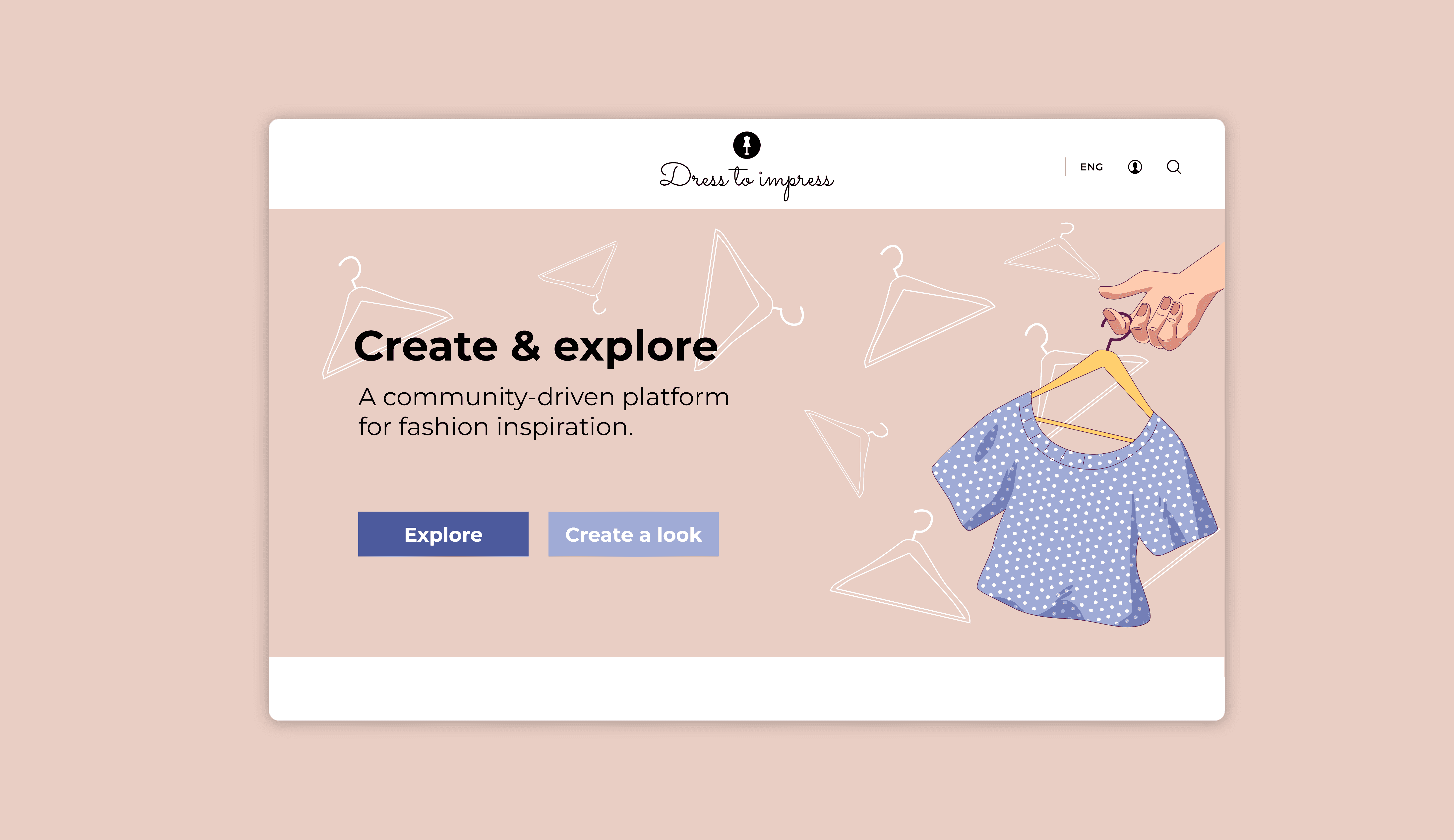
Entry point: Homepage → CTA Create a look
Flow:
• selecting Create a look,
• moving directly to the form with no intermediate screens,
• adding a short description, up to three tags, and an outfit photo,
• publishing the post,
• the outfit appearing automatically in the exploration section.
Key design decisions:
• no branching or alternative paths,
• a limited number of fields,
• a tag limit as decision support.
The flow was designed as UGC-first, focused on shortening publishing time as much as possible and lowering the barrier to entry.
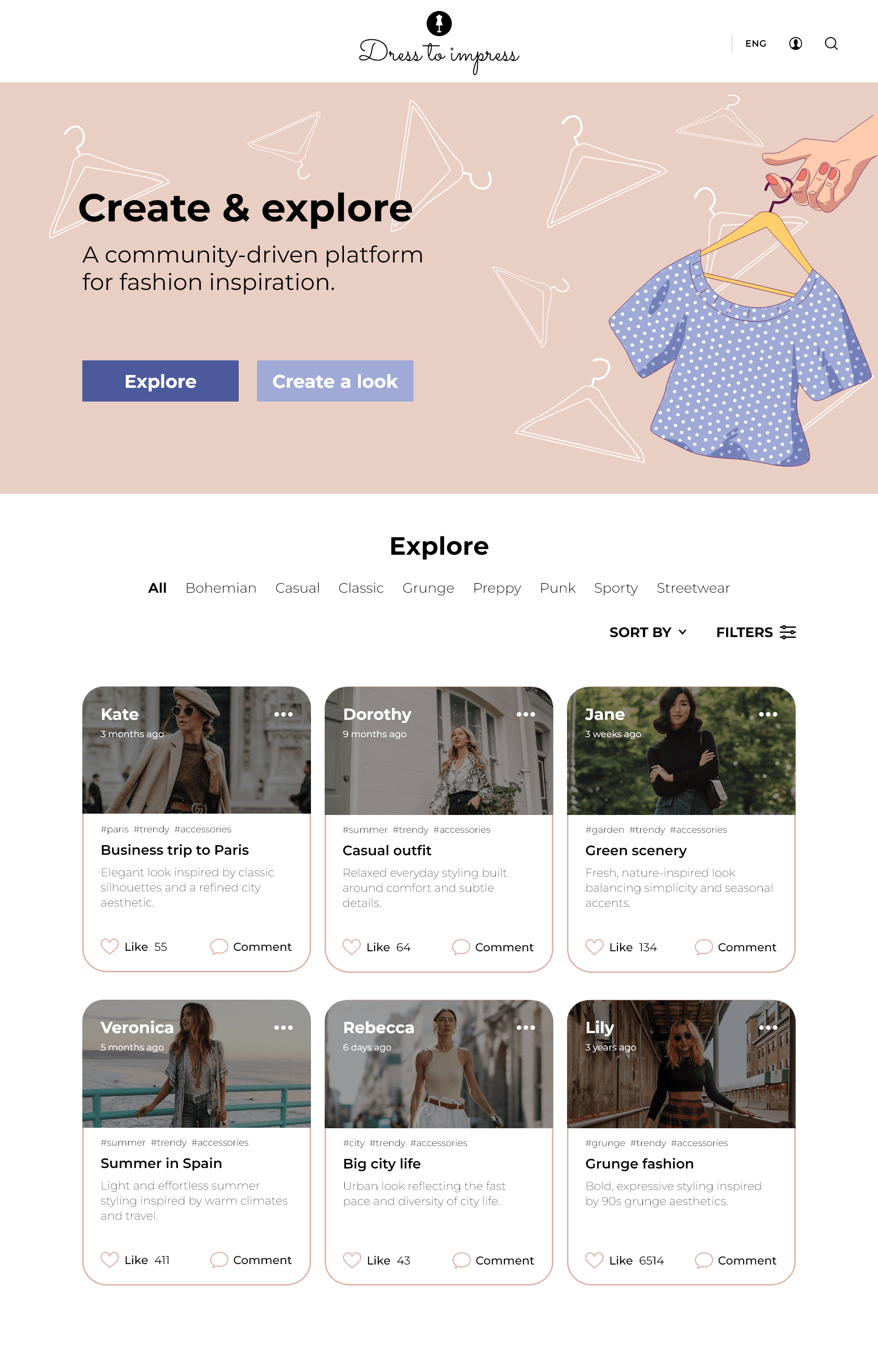
— Inspiration exploration flow
User intent: “I want to find inspiration that matches my style or mood.”
Entry point: Homepage → CTA Explore
Flow:
• moving to the outfit list view,
• browsing content as cards,
• optional filtering by styles and tags,
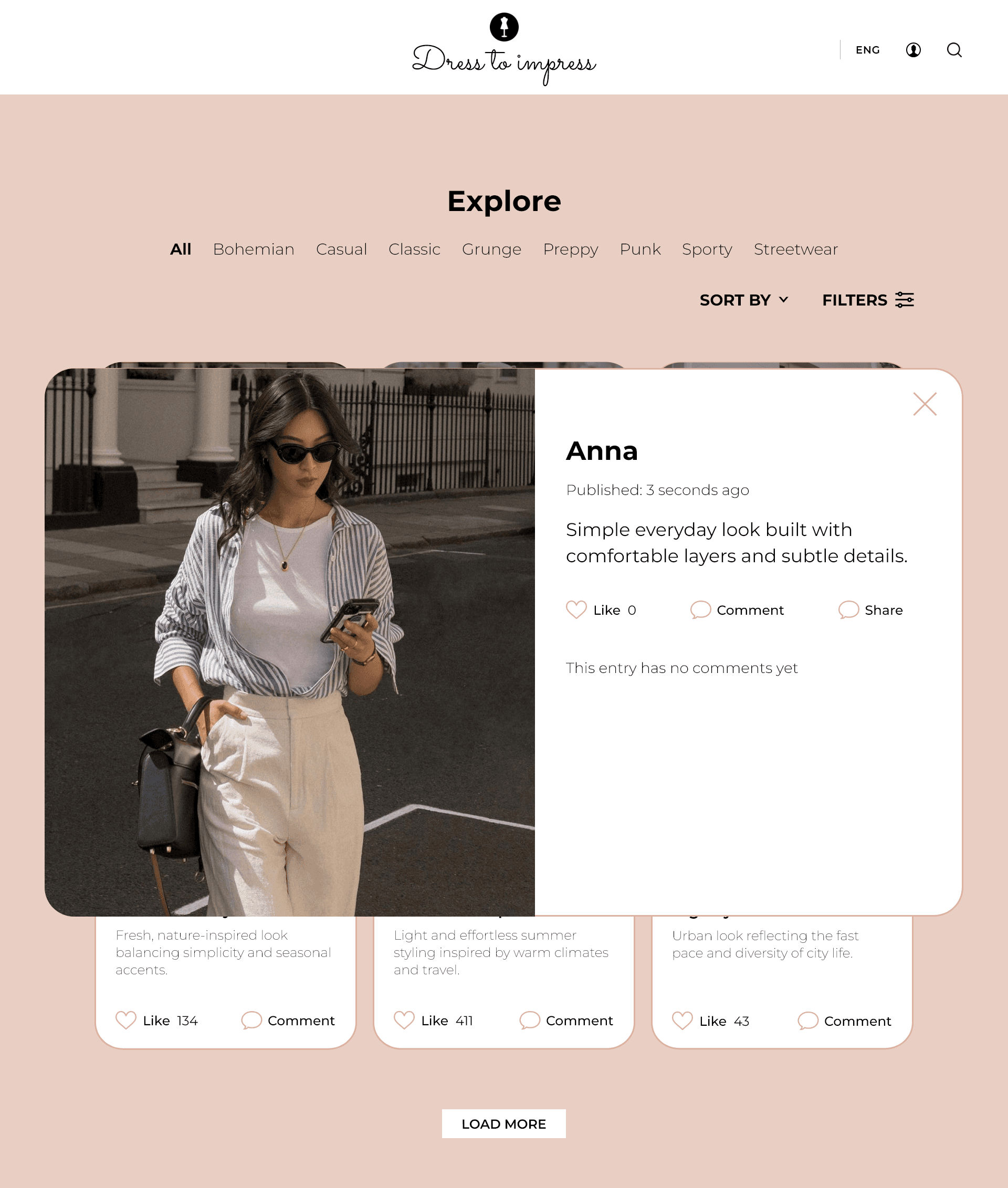
• opening a detail view with social features,
• returning to exploration without losing context.
Key design decisions:
• exploration as the default mode of use,
• filters as support, not a prerequisite,
• no dead ends in navigation.
The flow supports smooth content consumption and natural movement between inspirations.
UX writing
The interface language was designed to:
• be simple and inviting,
• support user actions,
• clearly communicate the purpose of each action.
The CTAs Create a look and Explore directly reflect user intent and remove ambiguity.
Content creation
The outfit submission form was intentionally simplified:
• a limited number of fields,
• up to three tags,
• no unnecessary steps.
This approach lowers the barrier to entry and increases the likelihood of content being published.
Social mechanisms
Designed elements:
• content author,
• publication date,
• likes and comments.
Their role is to:
• increase engagement,
• build content credibility,
• strengthen the sense of belonging to a community.
The project’s visual direction is built around:
• a muted, pastel colour palette,
• illustrations that support a lifestyle narrative,
• a lightweight interface and a clear visual hierarchy.
The digital branding was designed not to overpower the content, while reinforcing the platform’s emotional tone and supporting long-term product engagement.
The outcome of the design process is a set of high-fidelity wireframes presenting the platform’s key functional and visual assumptions.
The visualisation includes:
• the homepage with a value proposition,
• an exploration section for inspiration and outfits,
• the UGC content creation flow,
• social features.
The wireframes were created to validate the consistency of the information architecture and user flows, and to communicate the product concept at both UX and UI level. This is a conceptual project and presents the final design direction without an interactive layer.

Dress to Impress showcases my approach to designing research-led digital products, grounded in strategy and deliberate UX decisions. The project brings together user experience, digital branding, and marketing thinking into a cohesive concept for a social platform.